Website Navigation: Tips for Smooth Sailing
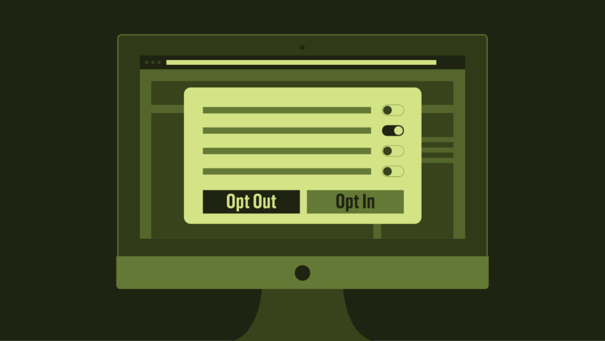
Navigation, whether you’re talking ships or the web, refers to a method of determining one’s current position, distance traveled, and plotting the course to a destination. When it comes to your organization’s website, you want your users to be able to quickly and easily find what they’re looking for. This is accomplished by putting an interface into place that clearly plots out the information and actions available and encourages them to move through your site with confidence.
It can be challenging to create a navigation system that takes into account the various goals of your users and showcases the different types of content you have to offer on the site. There’s no one-size-fits-all formula, and your web designer should be able to guide you to the solution that works best for your particular organization. In this post, we’ll define a few terms and considerations to help you, ahem, navigate that process.
First Things First
Navigation is built on top of what we call Information Architecture (IA). IA is the underlying structure of all the content and functionality on a website, how it is grouped and classified, and how pieces relate to each other. Content is usually structured hierarchically, with various tiers of content grouped under top-level categories. If you’re planning a redesign project, prepare to get a handle on the IA of your website.
You’ll be unsurprised to hear me recommend that you check your analytics data for signs of how well your current IA is working. Are people viewing the pages and categories you expect them to? Are they making heavy use of the search function or FAQ section? You may need to re-evaluate the placement and naming of categories and menu items if you’re getting low traffic, or give more prominence to information people are commonly searching for.
Tools for Building a Structure
Performing a content inventory (a list of what content you have) and audit (an assessment of that content) is a valuable step in a redesign project. It will help you identify relationships between content, eliminate duplication and outdated content, and suggest ways your IA may need to be restructured. A card-sorting exercise can help you understand how users interpret the structure of your content, and what content they find confusing.
Creating the Interface
Now that you’ve gotten a handle on your website’s content, how the different pieces relate to each other and have identified areas in need of improvement, we can start thinking about creating the interface that guides your user through the content of your site.
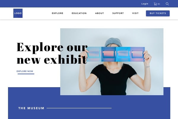
When we think of site navigation, we tend to go straight to menus. They’re not the only elements to consider, but let’s start there. A typical website will have several menus, depending on the amount and type of content to offer. You’ll see them running across the top of the page (sometimes in several different bands), down the side, hidden behind icons, and at the bottom. They can be static, sticky, fly-in from the side, or drop-down from above.
So what’s the best kind of menu to use? The answer, of course, is that depends! Rather than get into the nitty-gritty about each type, below are some general best practices and considerations.
1. Don’t overwhelm.
Please (please!) resist the urge to put all of the things in the top navigation section of the page. Being faced with too many choices at once is overwhelming. A global menu of 5 – 7 top-level categories is a good start.
2. Be consistent.
Sub-menus should look different from global menus, but be consistent in style across the site. Once a user knows where to look for one, they’ll assume the pattern persists across the full site, so don’t change things up on them on different pages.
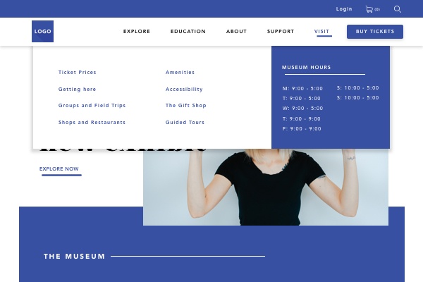
3. Indicate current location.
The present location of a user should be highlighted or indicated somehow on the menu. If you have a depth of content of more than two tiers, you could consider using “breadcrumbs” to facilitate the user’s journey back the way they came. Breadcrumbs typically look something like this, and are found under a sub-menu:
Education > Programs > High School > Field trips
4. Don’t hide it.
Yes, users have gotten used to an expanding menu hidden behind a single icon on mobile (often the ubiquitous “hamburger menu”). But that doesn’t mean you should transpose that aspect of design to the desktop experience. This study shows that hiding the global menu behind an icon leads to poor discoverability since it’s not readily evident what is available on the website.
5. Show me the way to go home.
Some conventions are made to be broken. This is not one of them. Your logo goes in the top left corner, and it links to the homepage, full stop. Check this study that finds it’s six times harder for a user to find their way home when the logo is centered instead.
What’s on the Menu?
There’s some finesse to naming menu items. The titles should be compact yet descriptive. There are reasons to avoid naming items after formats or audience types since that can obscure the information users are seeking. If you’ve opted for a “mega-menu” be sure to divide the items up into shorter, manageable sections.
Placement of items is also a consideration, with priority action items best placed either first or last for easy recall. Sometimes these elements are separated from the menu to give even more prominent placement (think “Buy Tickets,” “Subscribe,” or “Donate”).
Beyond the Menu
Navigation is not confined to menus, of course. The overall layout of your site will be made up of featured shows with compelling images, different calls to action, news or blog articles, related links — all of this is part of your navigation system that smoothly guides the user through your site.
Letting your users wander down the garden path, discovering content as they go, allows them to get to know your organization that much better. But make sure they don’t get lost by providing consistent signposts everywhere they go.
It’s worth mentioning that search engines are your new homepage. Users may enter through a variety of pages, depending on their specific search terms. So it’s essential that they can find their way through your site no matter where they start.
There is sometimes a case to be made for minimizing navigation the closer a user gets to a particular destination (buying tickets, for example). While they should still be able to get back home, they don’t necessarily need to be distracted by a global navigation system (more minimalist breadcrumbs are handy here). Landing pages that are designed to convert users are frequently stripped of all navigation, with the exception of the top left “home” logo.
Navigating on the move
Mobile navigation is more than hamburger menus. While screen real-estate is certainly at much more of a premium on mobile devices, there’s still a case to be made for category discoverability. This test shows an uptick in sales to e-commerce sites when a top link bar suggesting shopping categories is visible in addition to the expandable menu.
When designing for smartphones, it’s important to think about the “comfort zone” of where a person can click with their thumb while holding the phone in one hand (top left corner is a stretch for right-handed users). This article shares some considerations for bottom navigation on mobile. It focuses on apps, but the lessons are good for websites too.
Don’t Reinvent the Wheel
There are lots of ways to get creative with your website. Navigation isn’t one of them. Users are accustomed to looking in certain places to find information, and messing with that doesn’t serve them well.
The bottom line when it comes to navigation? Keep things clear, consistent, and easy to find.
Warren Wilansky is the president and founder of Plank, a digital studio based in Montreal that specializes in designing responsive websites and mobile applications. Plank is a proud sponsor of Digital Marketing Boot Camp for the Arts 2018.