Uncovering User Intent with Google Analytics and On-Site Surveys
If you’re a marketer, you’re probably familiar with Google Analytics, one of the most powerful free tools out there for monitoring your website. Google Analytics (GA) allows us to measure the activity of our site visitors in real time, at a super granular level and can inform everything from landing page design to site structure. It’s one of the essential tools to have in our marketing tool belts. We love it and have talked about it at length here, here, and here.
While GA can answer everything from “What is the most visited page on my website?” to “How many visitors do I have from Wichita, Kansas,” things get murkier when we want to ask questions about user intent or preferences.
Filling the Knowledge Gap
Sure, we know what the most popular template is, but what do our users like about it? What are their goals for their website visit? Did they find what they were looking for?
Knowing from a poll that 75 web visitors are ‘ready to purchase’ is helpful, but isn’t it more interesting to know that only 25 of them actually transacted? What happened to the rest?
Many of us have filled this knowledge gap with a site survey or poll, asking questions about user intent or satisfaction. For most organizations who have run site surveys, the resulting data has lived parallel to other website inputs like Google Analytics.
Imagine how powerful it could be to merge the platforms together to gain a more comprehensive look at user behavior on the website. Knowing from a poll that 75 web visitors are “ready to purchase” is helpful, but isn’t it more interesting to know that only 25 of them actually transacted? What happened to the rest? Why didn’t they finish what they came to the site to do?
On-Site Surveys In Action
In preparation for the Detroit Symphony Orchestra’s (DSO) website redesign, we used a combination of qualitative poll data from Hotjar and quantitative data from Google Analytics to better understand user intent and follow-through on the site. Below are some of our findings, and they’re specific to DSO based on their site and their users’ behavior. You should conduct a similar analysis to see what your user behavior is indicating.
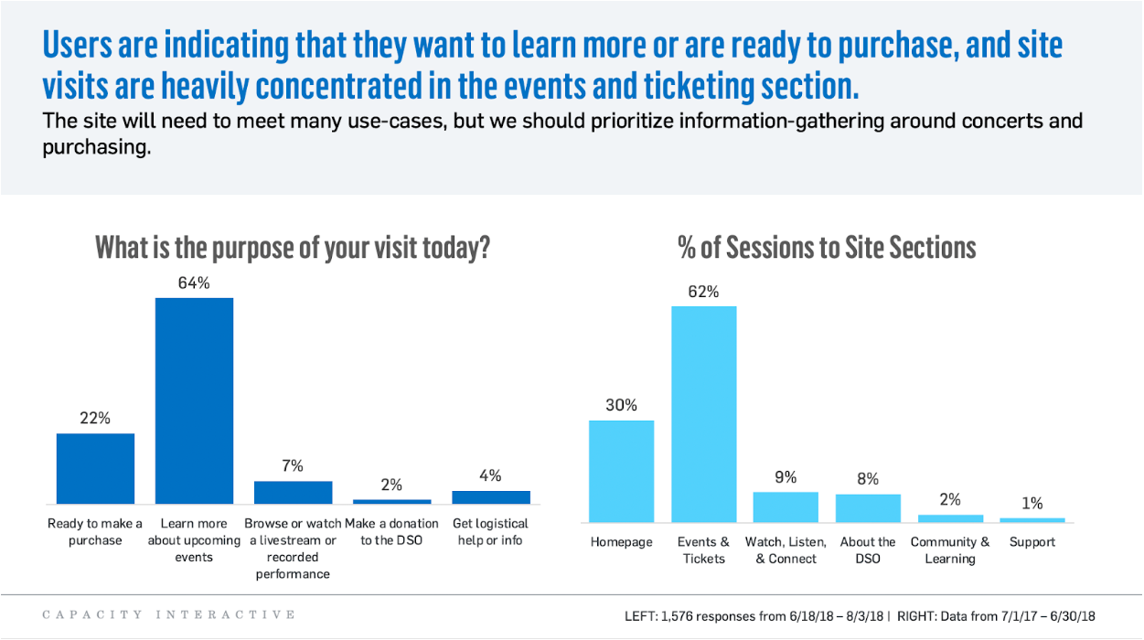
First, we looked at the information from each platform side by side and noticed correlations between survey responses and traffic to the site. Based on survey data alone, we could say that most users are on the site to browse events, but a content analysis from Google Analytics allowed us to confirm that most users end up in the event section. Being able to confirm a hypothesis from a number of sources means we can confidently prioritize template development during the redesign.
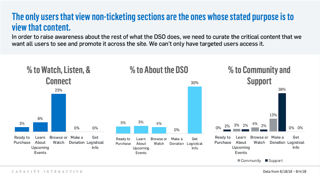
Where our analysis got especially interesting was when we integrated the data from the two separate data sources into one very powerful data set – we combined users’ survey responses about the purpose of their visit with their actual on-site GA behavioral data. When looking at the data through this lens, a critical insight was uncovered: the only users going to non-ticketing sections of the site are the ones who stated that was their primary intention.
While we were glad to see that the website enables those users to access the content they desire, the data indicates a clear opportunity for the new site: that the DSO “de-silo” their content and carefully curate event pages that are media-rich, informative, and make a donation ask at the right moment. Instead of building the content and letting it live in sections that will only be visited by the smaller set of users, we can raise awareness for the DSO’s rich history and its great non-ticketing initiatives to a whole new set of users.
To further supplement poll & Google Analytics data, we used Hotjar’s native screen recording tool to monitor user sessions and find behavioral patterns. The DSO gets thousands of visits a week, and watching all those screen recordings can be daunting. In order to stay focused and limit our viewings to relevant sessions, we used filters and built Hotjar event tags in GTM so we could sort recordings by key actions.
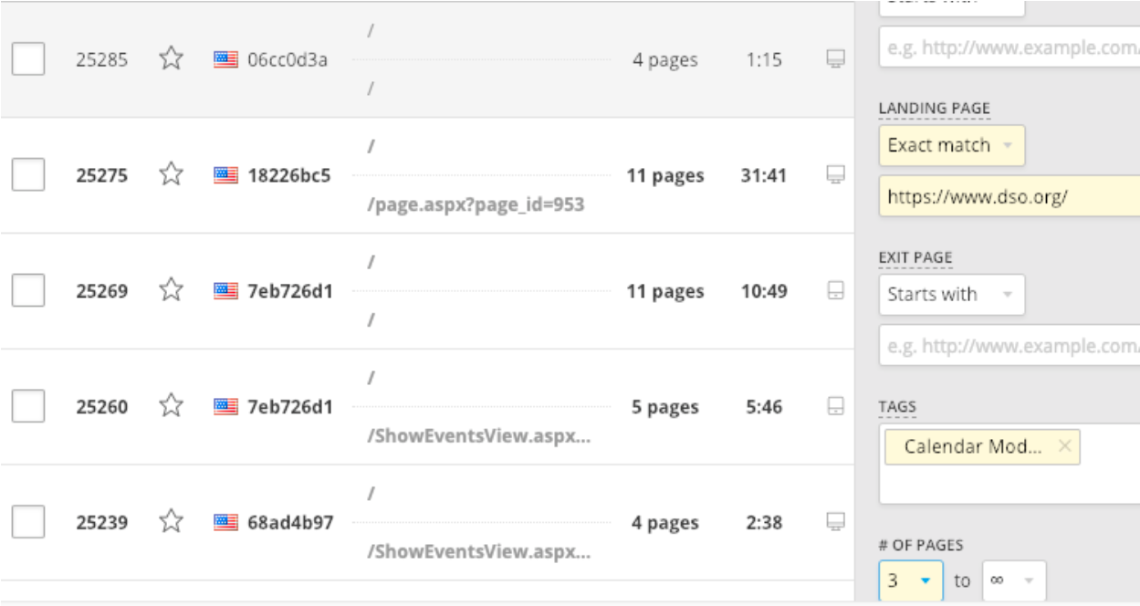
Sorting for sessions that started on the homepage, saw more than 3 pages, and engaged with the persisting calendar.
As we processed recordings, we added our own tags like “Demonstrated confusion” or “Encountered a bug” so that we could categorize these sessions and document how often those experiences occurred. Although the platform can capture thousands of sessions, patterns started to emerge after only 30-40 sessions. One was that users appeared to find it frustrating when they couldn’t locate a call to action:
Or that mobile users skimmed high-text pages and probably weren’t taking in relevant information:
These patterns then translated into clear recommendations for event detail page and mobile template design. Although video recordings alone didn’t provide all the answers the DSO needed to move forward with a website redesign, they were a powerful supplement to the analysis and a visual reminder that the new site had to prioritize the user experience.
After presenting the combined GA + Hotjar analysis, the DSO was then able to host a productive and focused series of stakeholder interviews to inform their website RFP (Request for Proposal), calling back to the data at key moments to keep conversations patron-centric. The resulting RFP and analysis deck helped them align their priorities for the project, stick to a timeline, and end up with a vendor that would not only meet their needs but be a quality partner that shared their goals.