The Principles of Ethical Web Design
As a performing arts organization, you are constantly looking for ways to wow audiences, challenge norms, and be the best version of yourself. For every performance and event, you are looking to offer audiences a memorable experience that makes them want to return again and again.
While you want a website that connects with your audience from a storytelling perspective, you also want to offer them an experience driven by a series of design and development choices that meet your standards. You want to offer them an ethically driven experience.
What is Ethical Web Design?
Ethical web design, simply put, is about putting your users first. It’s a thinking approach that questions how your website serves its visitors and the planet. It’s not necessarily meant to focus on good vs. bad practices but rather how you evaluate your practices.
Is your website accessible to a wide audience? Are you using inclusive language? Do you protect users’ privacy? Is your website sustainable? These are the types of questions that come up when thinking about ethical web design.
It’s important to think about how your digital space impacts your users. When your website is more inclusive, you make your content available to more people, improve your overall user experience, and improve your SEO. To help you develop an ethical web design approach, we have outlined five principles that you can implement into your website redesign process.
Accessibility & Inclusion
People use the internet for important tasks such as accessing bank information or booking appointments. They also use it to buy tickets to the latest exhibitions, donate to arts initiatives, or stream live musical performances. Creating accessible and inclusive digital spaces provides meaningful experiences to everyone regardless of any disability or their access to modern technology.
A great guideline for web accessibility is the Web Content Accessibility Guidelines (WCAG) created by the W3C Web Accessibility Initiative (WAI). These guidelines outline how to make your content, code, and design more accessible to those with a variety of different abilities. It covers everything from how users perceive elements on their screens to how they navigate interfaces.
For marketers, accessible and inclusive digital experiences are created through your content. For example, when you communicate with your arts community online, you want to ensure that individuals can easily perceive and understand your message. Here are quick ways you can publish more accessible content:
Write Mindful Copy: When using industry language, expressions, and acronyms, make sure to explain their meaning properly. Some individuals can’t infer meaning, so using simple language ensures that everyone understands your message.
Use Alternative Text: Alternative text, also known as alt-text, is an image description read by screen readers or displayed when there is no internet connection. You can input alternative text within your CMS. Well-written alt-text should be descriptive yet concise.
Use Contrasting Colors: All your text on images, call-to-actions, and branding materials should use contrasting colors. Individuals don’t perceive colors in the same way, so using colors with higher contrast ensures that you cater to a larger audience. Check your color contrast.
Privacy & Security
In a world ruled by data, it’s very important to protect your users’ personal information and provide a secure website. When users provide credit card information to purchase tickets or private information for their child’s arts camp, they want to know their information is safe. Privacy and security are crucial to gaining trust and building a better user experience. In most cases, it is legally required to be transparent and protect user data, but it is also key to your brand’s health!
When you do collect user data for a personalized experience, it’s important to remain transparent. To ensure transparency and secure data handling, you can build your processes on the seven principles of the GDPR – the EU’s basic regulations and expectations for data protection. These principles allow you to be proactive rather than reactive.
Here are a few actionable steps you can take to ensure a more secure and transparent digital experience:
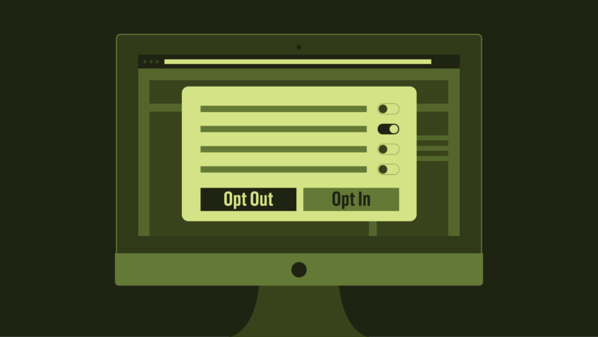
Obtain Consent to Track Cookies: If you collect and track data, you must ask for clear and specific consent. Using a pop-up, you can ask users to allow or decline the use of cookies on their browser. It’s incredibly important to give users the option instead of a default “accept.”
Limit Data Collection: Make sure that you collect the minimum amount of data required and store the information for only as long as necessary. To clearly communicate what information you do collect, how you store it, and who you share it with you can include it in your Privacy & Terms of Use.
Consider Double Email Opt-ins: For your email campaigns, you can increase transparency by providing confirmation links for subscriptions. Although not required by GDPR, it can be a great way to ensure proper consent.
Device-First Design
When websites were first being built, they were made specifically for desktop screens with low resolutions. Now websites and applications are being built for a wide variety of screens and devices. Even refrigerators are getting specially-made apps!
Although your arts audiences most likely won’t view your website on a fridge, device-first design allows you to create consistent experiences across all devices. By taking into account your audience’s viewing preferences, it ensures that all aspects of your website are optimized for different screens including your website navigation.
Individuals don’t always navigate websites in the same way. Some users might use a keyboard as opposed to a mouse, while others might use assistive technology. Thinking of how your users explore your website is imperative to providing an equal experience to everyone no matter the device they’re using.
There are many things to consider when applying device-first design, but here are things to consider:
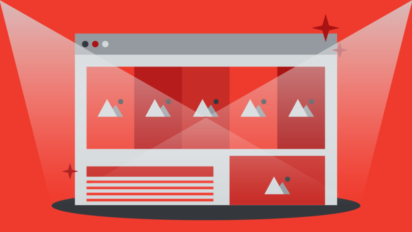
Optimize Your Images: To make sure your images load quickly on all devices (while also looking good) it’s important to optimize your images. You can do this by creating a couple of versions of your images to cover desktop and mobile devices. Make sure you scale your images to the correct size for the most common devices.
Simplify Your Content: Carefully consider the information you are providing users and practice bringing users to desired info within a fewer number of clicks. On mobile devices, your screen’s real estate is much smaller and content requires rigorous prioritization. Focus on quality over quantity.
Use a Minimalist Design: Remember that a little goes a long way. This doesn’t mean sacrificing your brand or eye-catching designs but rather focusing on keeping your website navigation and layout intuitive and simple. This is the best way to ensure a uniform experience across devices.
Development Best Practices & Sustainability
Working on a digital platform is to consistently have a willingness to learn. The internet is constantly evolving and new technology is always being developed. With this in mind, it’s important to look at your website with a long-term lens and allow for consistent improvements.
With forward thinking, you can create a website that can be easily maintained and iterated on. When it comes to development best practices and the sustainability of your website, its brand, navigation and code will play a big part. Whether you’re using pre-built templates or a web design agency, there are certain standards you should be aware of.
Branding Standards: The design elements that define your brand and attract your target audience.
Navigation Standards: The principles that affect how users navigate your site and improve your user experience.
Coding Standards: The standards that ensure your website runs smoothly and efficiently on all devices.
Having knowledge of these standards — or a website development partner that does — will allow you to go beyond the visual appeal of your website and build a website that is more sustainable.
Don’t copy-paste text into your CMS: When you are copying text from an email or document into your CMS, you can be bringing in unnecessary code into your site. Make sure that you paste as plain text or use a tool like NotePad.
Consider Headless CMS: Headless CMS is a modern development technique that loads your site quickly and efficiently. It is widely used in the WordPress community and ensures an impressive site speed.
Document Your Website: Your website should be well documented, in two key ways. Documented so that you can use your site well. Documented so that all future website design partners can work on the site.
Environmental Considerations
The benefits of technology are endless and it has undoubtedly improved the lives of countless people. But we rarely take the time to consider its repercussions. The daily use of technology has huge effects on the environment from the energy it takes to power data centres to all the e-waste produced due to frequent tech drops.
Working in the digital field means that we have some sort of responsibility to consider more sustainable tech practices. Any little bit helps when it comes to pursuing more environmentally friendly solutions.
If you are looking to implement more green practices into your website, here are a few steps you can take:
Switch to a Green Web Host: A green website hosting company is one that aims to reduce the environmental impact of their organization through data centers that are powered by renewable energy, use eco-friendly cooling, or offset their emissions.
Reduce the Size of Your Images: Images can be a huge contributor to your page weight and they can use up a lot of energy. Before adding an image, ask yourself if it is valuable to your users or if you can reduce its size.
Avoid Unnecessary Plugins: Plugins can increase your server load and add weight to your front end. Choose plugins that add value to your website or CMS.
As you head into 2022, take some time to consider your current website strategy and look at it from a few different angles. Big, sprawling redesigns are an exciting, and somewhat daunting, project to consider so make sure that you have a holistic view of the project not only from a design and technology perspective but also ensure that it lines up with your values.
A website is much more than a series of well-designed pages, but in many ways, a statement on who you are as an organization and what values you hold deeply. Your online presence offers you another great opportunity to fully reflect your vision, values and ethics and share them with your community.
Warren Wilansky is the president and founder of PLANK, and Stephanie Beasse is a Marketing Coordinator at PLANK. PLANK is a digital studio based in Montreal that specializes in designing responsive websites and mobile applications. PLANK is a proud sponsor of Boot Camp 2021.