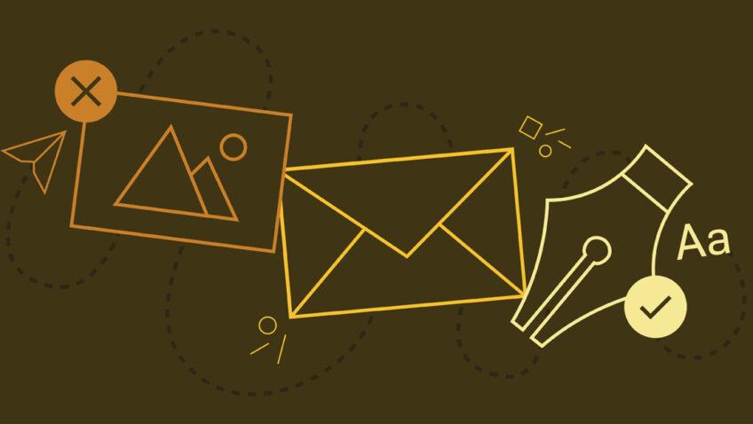
Mobile-First Email Design: Five Steps You Can Implement Today
With the ever-increasing dominance of smartphones, mobile-first design has become the priority of businesses across industries and around the world. Mobile-first design impacts websites, social media content, and emails.
It can be hard to make changes to all platforms, particularly when budgets are small, staff resources are stretched thin, and updates require sign-off from multiple departments and/or senior leadership.
Unlike websites, however, implementing mobile-first design in your email platform doesn’t require a massive budget. With just a few simple changes that won’t require a template redesign, you can achieve mobile-first design without scheduling another department meeting.
Below are five simple steps (plus a bonus step) you can take today to make your emails more mobile-friendly. You can also see them in action in an Opera Philadelphia email I’ve included in this post. The numbers next to the tips correspond with the numbers on the email. Let’s get to it!
1. Go Big or Go Home
Enlarge your font size. This is one of the simplest and most effective tactics to enact right now. I recommend 18px or 20px as your standard paragraph style and 22px and above for headings or heading bars. Your fine print can stay small, of course; 14px is readable without distracting from your main message.
2. Hit the Space Bar
Negative space is your friend. Add line breaks between sentences or paragraphs of copy. You can also increase your padding or margins on all sides of content blocks.
3. It’s Hip to be Square
Use square images as much as possible and consistently throughout an email. If you’re using two or three column blocks with images, keep the image sizes consistent across the columns for a clean look.
Bonus tip: Keep text minimal or entirely out of images! Text within images won’t scale on mobile, so it can be hard to read at the smaller size.
4. Less is More
Use fewer words and keep paragraphs short. You want to give just enough information for the user to get excited, then direct them to your website for additional information. Once they’re on your website, start tracking them!
5. Fat and Juicy Buttons
If the primary goal is to create excitement and send users to your website to learn more, then make it easy for them to do so! Prioritize call-to-action (CTA) buttons over text links and make those CTA buttons as large and easy to follow as possible. Imagine a user scrolling through your email…how will they actually take their next step and get to your website? Give them a fat and juicy button with a pithy and engaging CTA! Check out Capacity Interactive’s CTA Generator, and the 2.0 version for inspiration.
Bonus Tip
When you have more time on your hands, take advantage of hidden blocks and create separate content streams for desktop versus mobile. You can get away with (slightly) more text on desktop view, so share a paragraph-long artist biography on desktop and the three-line version on mobile (with a link back to your website for the full picture). Ask your graphic designer to create graphics in multiple sizes and with different amounts of text (no text is ideal for mobile). Always remember to test both versions before deploying to make sure everything is hidden and arranged correctly!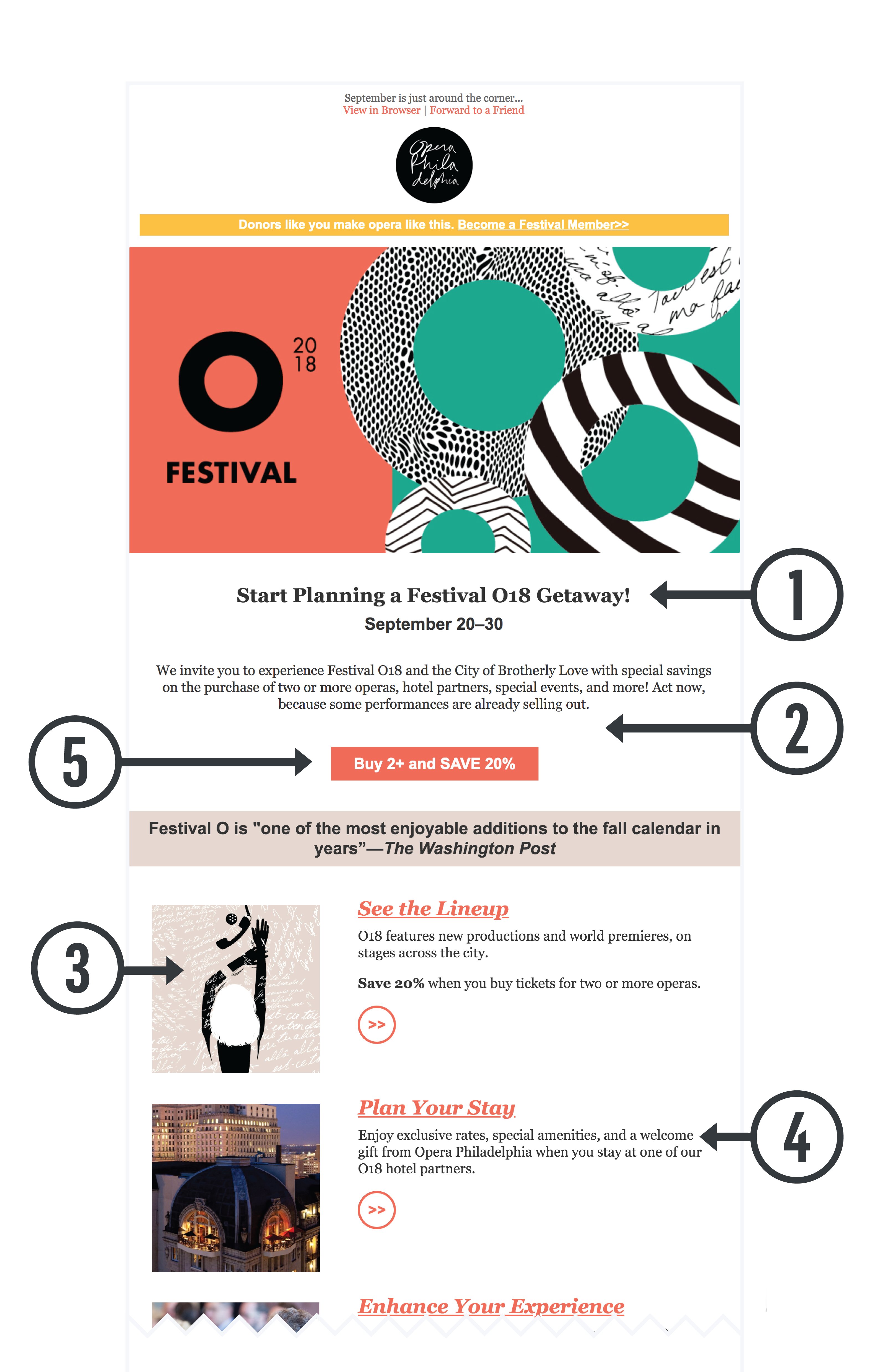
By implementing any or all of the above steps, you’ll deliver clean, easy to read emails for the reader on their morning commute. Or the reader scrolling their inbox while watching The Great British Baking Show. Or the reader taking a lunch break who wants to read the detailed plot synopsis of Hamlet and has the time to do so. Take 20 minutes and try one of these out today!
Karina Kacala is the Marketing Manager at Opera Philadelphia. She will be speaking at this year’s Digital Marketing Boot Camp for the Arts on Email 2.0.