Email Design Best Practices: Illuminating the Intimidating
Designing for email is both a skill and a mindset. In the past few years at CI, we have gone on a journey with our email templates—officially redesigning twice with iterative optimizations.
Now, as much as I love sweets, I’m not going to sugarcoat this for you: email is one of the most intimidating parts of your brand to design. Researching email design alone will inundate your brain with countless lists of best practices, what feels like a dangerous amount of HTML coding, and a feeling like it’s impossible to get anything right. I have been there, and I made it to the other side—soaring, stumbling, and flourishing through it all.
Before we dig into some best practices for email design, let’s adopt a collective mindset. As kids, we learned the ‘golden rule’: treat others as you would like to be treated. As email marketers, I would like to propose a new ‘golden (email) rule’: send emails that you would like to receive.
With this in mind, let’s illuminate some realities of email design and give you actionable tips to help make your emails better in an ever-evolving digital landscape.
Image-based emails are beautiful but not accessible
The great debate among email designers and marketers revolves around the two core approaches to email design: image-based or text-based emails.
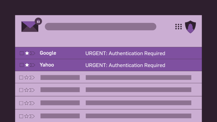
- Image-based emails allow you to have the most control over your brand but are fundamentally inaccessible in many ways. It includes emails that are just one big image or one big image sliced into different sections and pieced together.
- Text-based emails are incredibly accessible but don’t allow you to have the most control over your brand. Don’t let the name fool you—these emails do include images and other elements, but the text throughout is written in text boxes and rich text fields instead of being saved out as part of an image.
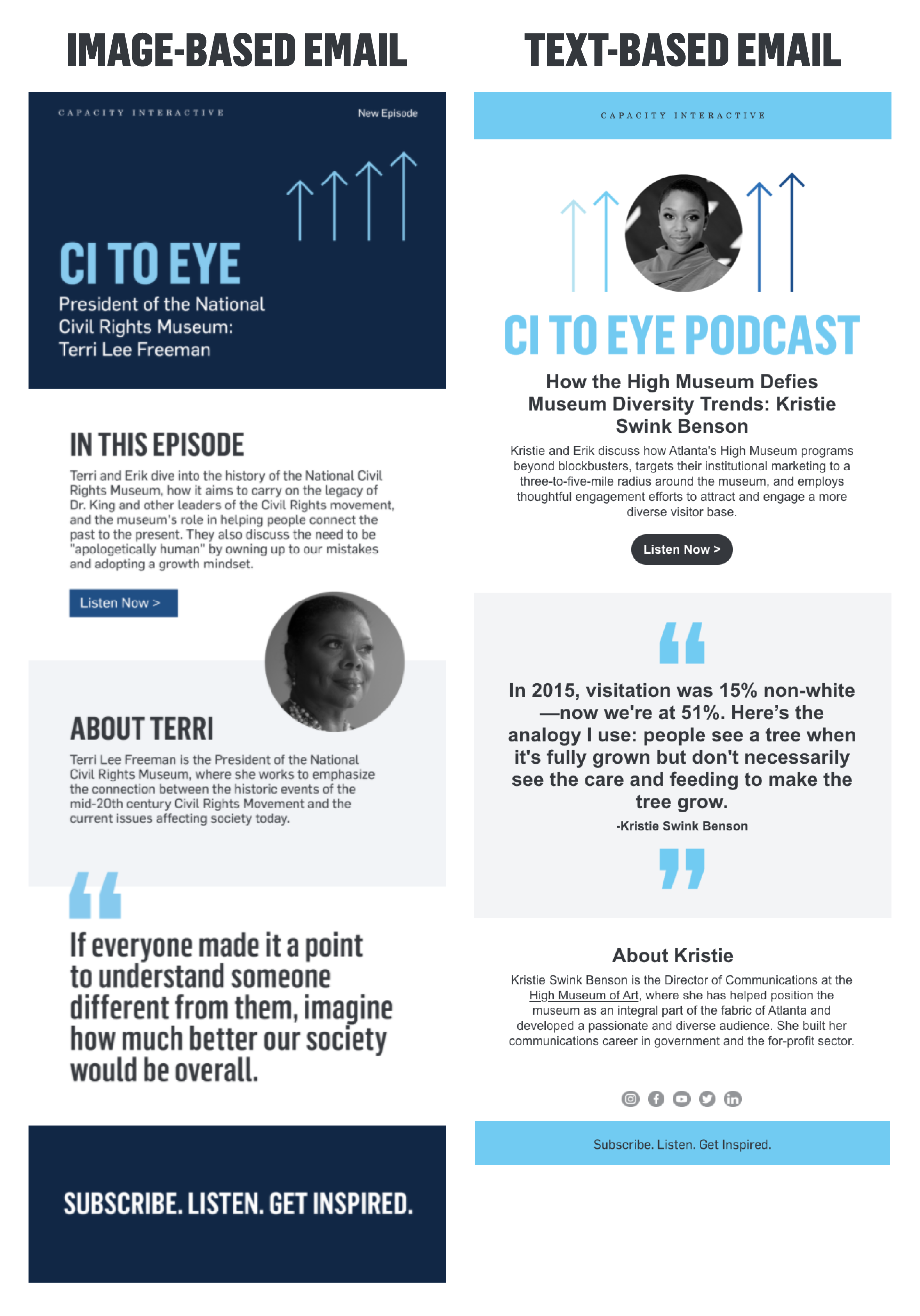
Image-based emails are ~tempting~ for designers, mainly because many retail companies use them for their marketing emails. I, too, was lured by how sexy our brand looked in image-based emails, so we used this method for our first CI email template redesign in 2017. At the time, I was prioritizing control and perfect branding over the user and overall accessibility.
Accessibility should always be the rule, not the exception. Now, I am not an expert in accessibility best practices, but I have learned a lot from having transitioned from image-based email templates to text-based.
Using image-based emails now? That’s okay—don’t stress! Until you’re able to change, make sure you’re at least following these best practices:
- Avoid one long image. Instead, slice it into many pieces. It will allow you the opportunity to write alt text for one block at a time instead of alt text for the entire email in one image’s alt text tag.
- Always include the web browser version. If users have their images blocked or turned off by default, your email will look like a mess. But, giving the ability for them to click/tap on the link to view your email in their browser ensures everything looks beautiful.
- Always include a plain text version of your email. Most email providers have this built into their platform. Be sure that the text you include in this version of your email is accurate and well-structured.
Ready to make the switch from image-based to text-based? Awesome—here are the two most critical things you can do to take your emails from zero to 100:
- Use a basic, default system font. It’s an absolute pain in the a** to add branded fonts to your email templates. It requires a lot of coding knowledge, and most of the time, the branded fonts won’t appear in the email clients for the patrons on your list.
- For every text box and rich text field in your emails, it’s your smartest and safest bet to use one of the basic, default system fonts. I know, I know. It sounds like a nightmare from a visual identity perspective. Just go with it—it’s accessible, and I promise it’ll save you hours and hours of migraines trying to get your branded fonts to work. See this as an opportunity to find strategic moments where you want to use your branded font saved out in an image—perhaps for your hero design at the top of your email? (Pssst, that’s what we do!)
- Add padding to your margins. Unfortunately, most text boxes and rich text fields default to having the absolute worst padding and margins around the text. Often, this means it looks like you have zero white space and hardly any breathability around your content. Adding at least 25px of padding to the left and right margins of your text will make a world of difference—especially on mobile.
Dark mode is a blessing and a curse
As a user, I love using dark mode for email on my devices. It feels fresh, clean, and easier on my eyes. However, as an email designer, I find dark mode to be extremely challenging.
Dark mode fundamentally affects two things in your designs: 1) images and 2) colorized elements (like text or buttons). If your organization has not previewed or tested your emails in dark mode, these changes will be invisible to you.
Images: Almost all images should be saved with transparent backgrounds. This will most likely impact your organization’s logo or any additional partner/sponsor logos you include in your email.
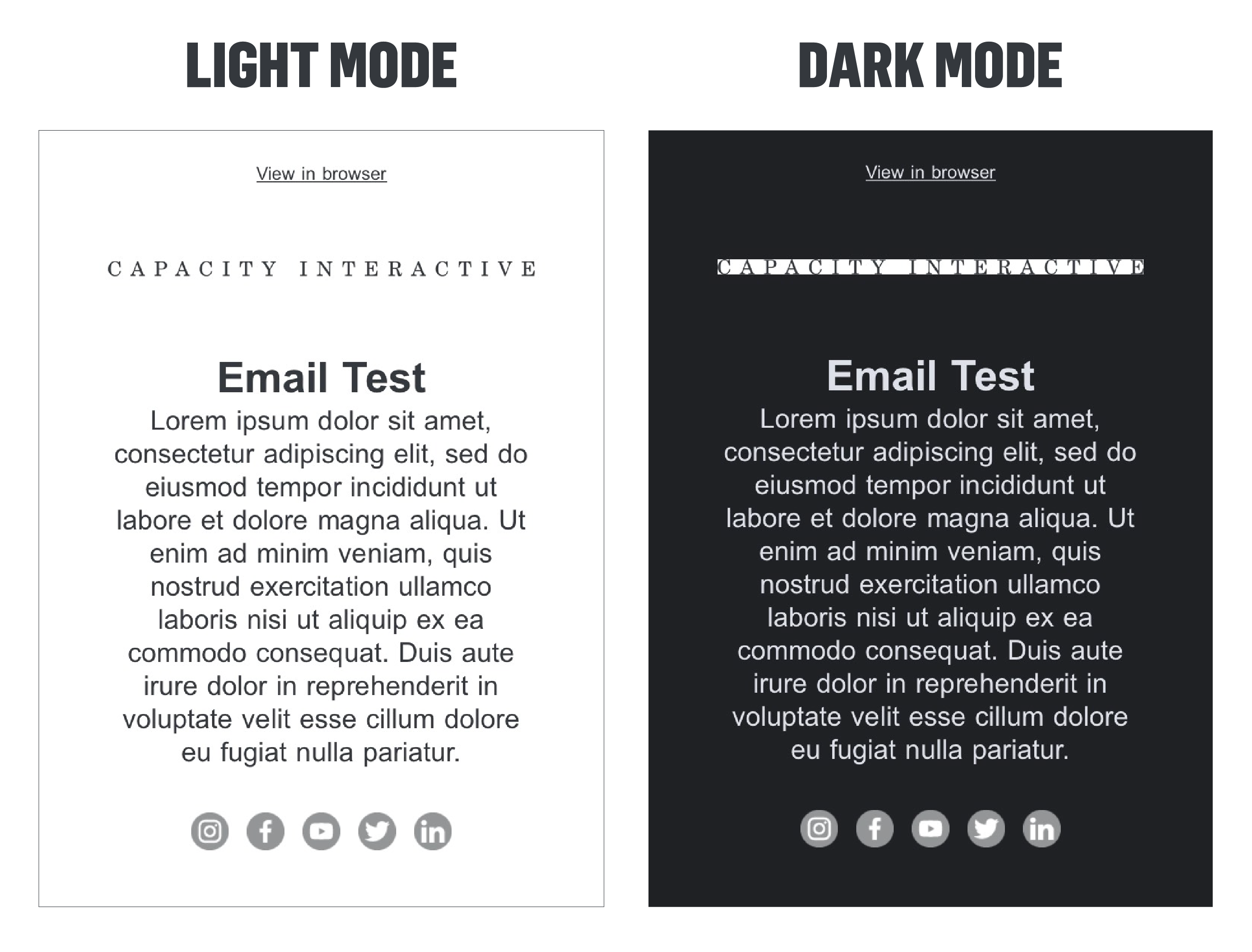
Add transparent background: If your logo is any color other than black/dark gray or white/light gray, removing the background and saving the image with a transparent background will look perfect in dark mode.
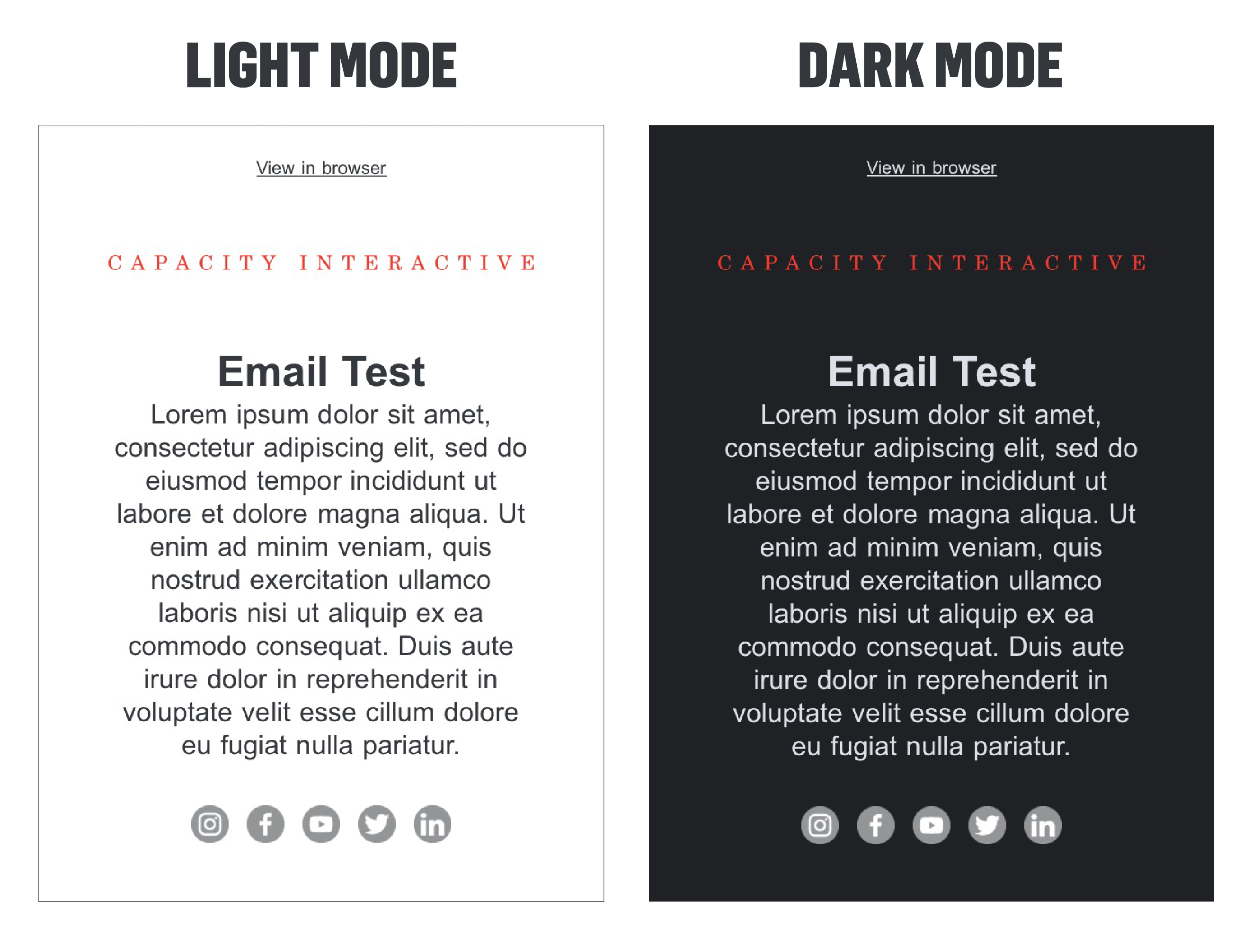
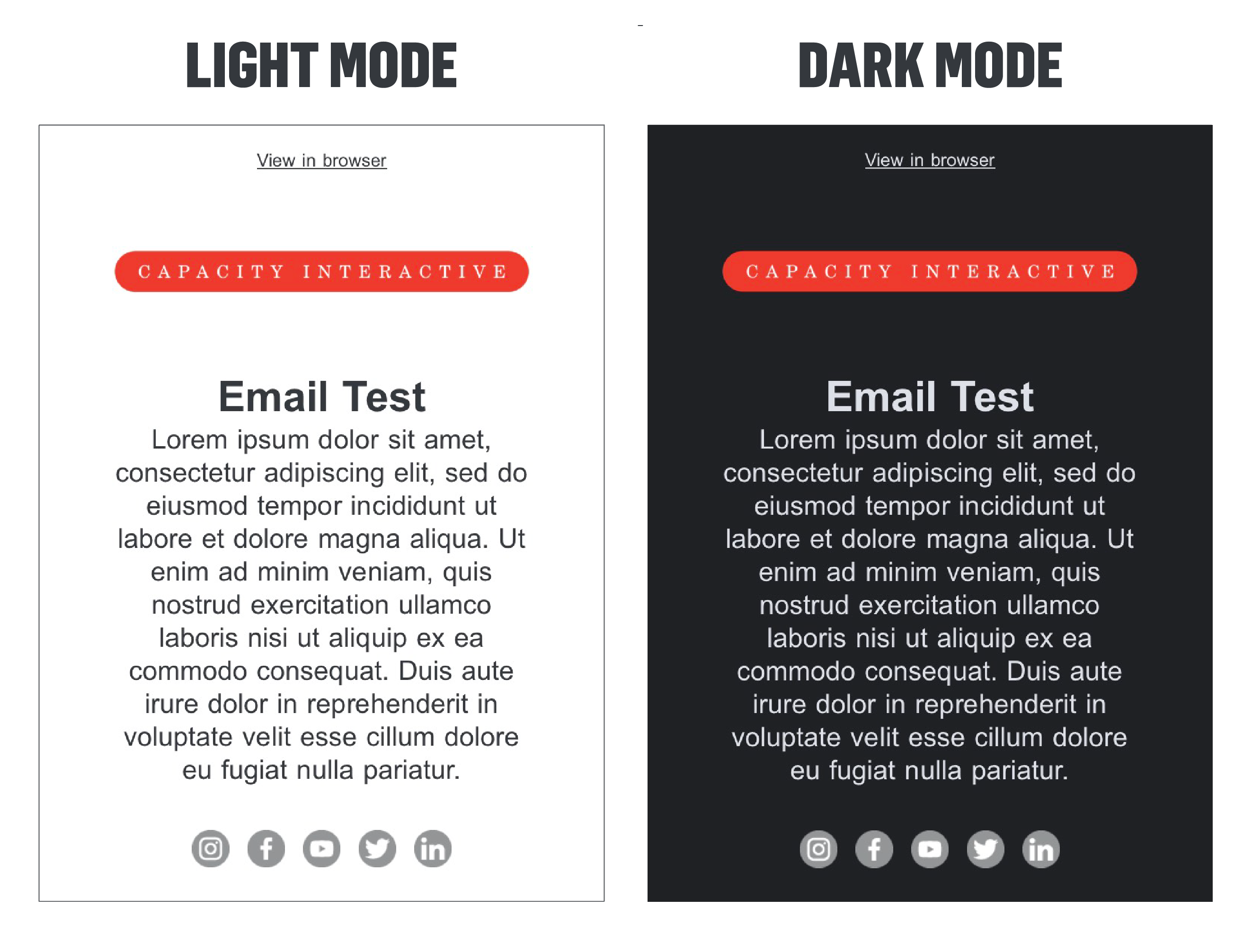
Add an outline, purposeful background, or shadow: If your logo is black/dark gray or white/light gray, removing the background and saving the image with a transparent background will not work in dark mode or light mode, respectively. You’ll need to add an outline or shadow to the logo to be visible in both light and dark mode.
 Colorized elements: Color inversion is a real thing that happens. All email clients display dark mode differently, which makes our lives even more complex. When your devices are in dark mode, this happens:
- Apple Mail desktop and mobile app: no color inversion
- Gmail mobile app: full-color inversion
- Outlook mobile app: partial color inversion
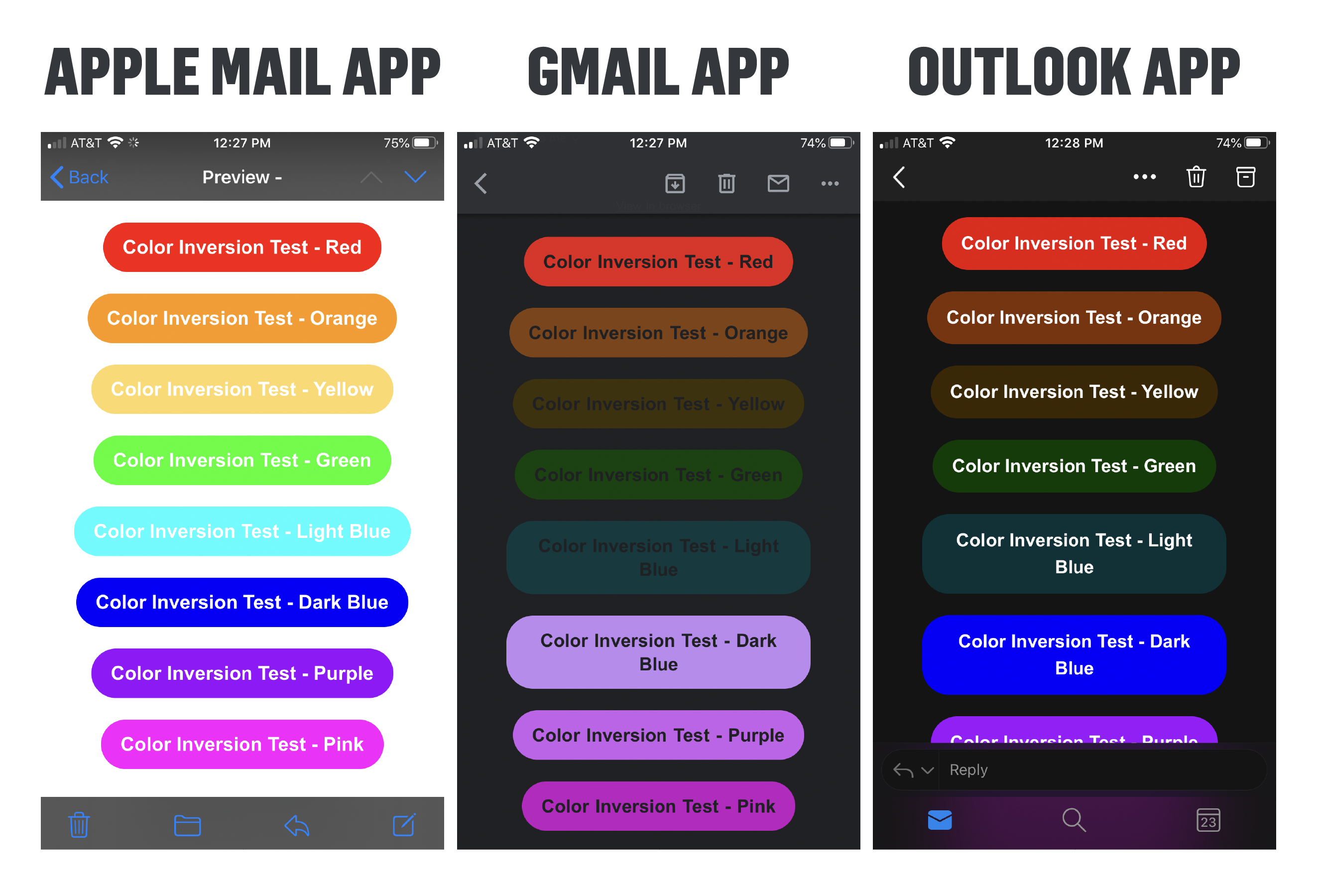 You have two options to ensure your colorized elements are looking stellar:
- Option 1—keep colors intact: if you are comfortable with how the colors in your emails look in dark mode, you don’t need to make any changes!
- Option 2—change it up: if you are unhappy with the colors in dark mode, I would recommend simplifying the hard-coded colors in your emails for text and buttons to be black/dark gray or white/light gray. These will be neutral colors that will invert to other neutral colors: black inverts to white and dark gray inverts to light gray—vice versa.
Email testing lives at the intersection of great power and great responsibility
If I were magically granted three wishes, one of them would be to make emails display and function the exact same across all email clients and devices. However, until I find a genie in a bottle, we’ll just have to accept the complex reality of email testing.
Litmus did some math on how tough it is to design for email. If you consider that there are 15 operating systems, 50 email clients, five screen sizes, and various other factors, every email you send has about 15,000 potential renderings.
Let me say this upfront: you cannot and should not plan for your email to look perfect across every possible rendering. This is one of those instances where you should prioritize. Be sure your emails look good and function appropriately in the most popular email clients and devices for your patrons.
Not sure where to start? For now, I’d recommend prioritizing your testing in Gmail, Outlook, and Apple Mail—both in your desktop’s web browser and your mobile device’s app.
Not only should you spot check your emails to make sure they look correct, but you should also be checking the following elements:
- Click/tap on all hyperlinks, buttons, and images. Are they working? Are they going to the correct place?
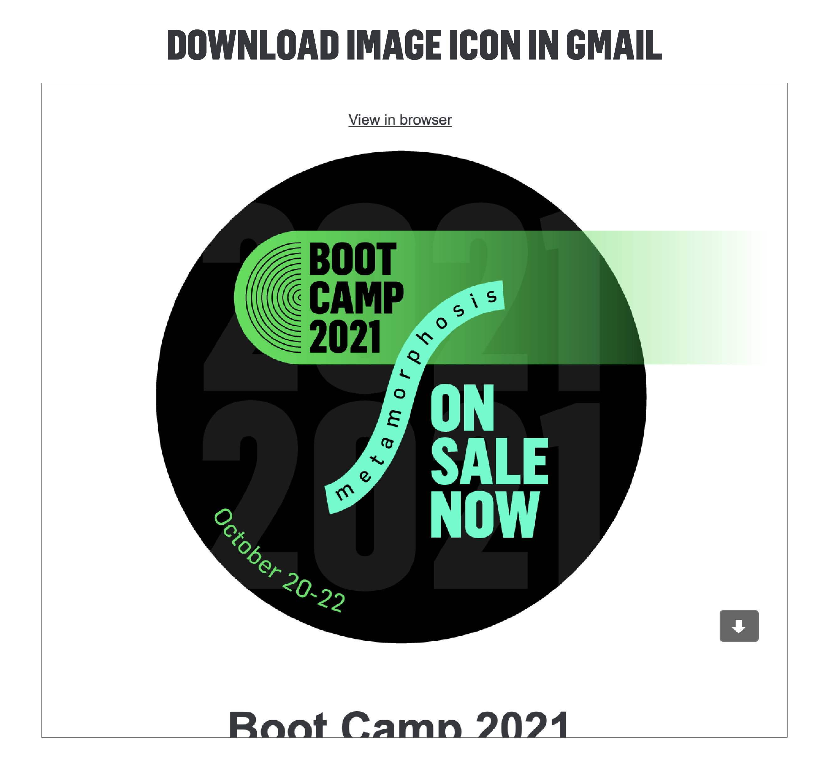
- Pro Tip: Every image you add to your emails should be linking to a URL. Why? Because of Gmail. If an image isn’t automatically linked to a URL in Gmail, a little download icon will appear in the bottom right corner of the image. If you don’t have a URL that makes sense to link to, we always default to using our homepage.
- Click/tap on the web browser version of your email. As I said earlier, this is a must-have. Some organizations don’t include this, but a link to the web browser version of the email allows folks to be able to view the email if it fails to render—or fails to render correctly—for them in their email client.
- Does the device you’re testing default to light mode?: Remember to temporarily switch to dark mode to confirm everything looks good on dark mode.
No matter your organization’s budget, size, or email cadence, you have the power to make your emails more user-friendly and a strong representation of your brand.
Feel like you’re already in a strong place with your email designs? Look ? at ? you ? go! ? Just remember that the landscape of email design changes by the minute, so iterative optimizations are required. As with all touchpoints and expressions of your brand identity, the evolution of your brand is never static and unchanging. It’s an evolution, not a set-it-and-forget-it mindset.
Feeling energized and excited to design (or redesign) your current emails? That’s what I love to hear! You will make mistakes, find things that go wrong in your template design testing, and be frustrated by inevitable changes in the email landscape. Take one day (and one email) at a time. We’ll just be here as your friendly reminder to be okay with imperfection—trust yourself, your team, and your brand!
Feeling totally overwhelmed by all of this? Cool. Welcome to my relationship with email design circa 2017.
- First, I’d recommend doing an audit of the types of emails you send. You can organize these by initiative or by goals—in whatever way works for you! Even if every email you send feels utterly disparate from the rest, I guarantee that you’ll still be able to find consistency and cohesion in the way you approach specific content modules or thematic elements.
- Next, explore drag and drop functionality. Most email providers have some sort of drag and drop email design functionality. You don’t have to be a developer or expert coder to create stunning and effective emails. Instead, consider the drag and drop functionality to be a sandbox for you to play around with—you can’t break it, just have fun!
- Lastly, do an analysis of your patrons’ most popular email clients and the device breakdown. It will guide you in knowing what to prioritize with testing.