Creating Accessible Social Content
6 Questions to Ask
Accessibility: for those of us who aren’t experts, it can be an intimidating mountain to climb. The marketing team at CI aimed to make our social content more approachable to people with varying access needs like blindness, deafness, and cognitive disabilities.
Still, we struggled with imposter syndrome, self-doubt, and, perhaps most importantly, perfectionism. We knew that taking the time to craft a social media accessibility strategy was crucial, so we decided to take action this year.
We’re sharing our journey with you, imperfections and all, to highlight the questions we asked ourselves, the roadblocks we encountered along the way, and the learnings we’ve discovered. Of course, your organization’s experience with navigating accessibility will be different, and the best practices you find for your organization will differ from ours, but we hope you feel inspired to consider these six important questions.
What Access Needs Are You Seeking to Address?
Before diving into accessibility research, it’s essential to identify your goals.
Our Goals
We aimed to identify strategies to ensure our content would be understandable and valuable regardless of how people accessed it, including through the assistance of a screen reader (a tool that helps individuals with visual impairments use computers and mobile devices) or through visual inputs only.
What We Did
Once we identified the areas of accessibility we wanted to understand, we divided and conquered across platforms: researching accessible post caption copy, alt text and image descriptions, design, and closed captions. Next, we shared our notes in a Google Sheet, adding links to valuable resources. Then, we presented our findings to each other—usually prompting more follow-up questions than definitive answers!
What We Learned
We learned that Googling alone wouldn’t get us all the answers. We needed to test screen readers to understand how to make our content truly accessible for this technology, so we used Apple’s built-in screen reader, VoiceOver, on our MacBook and iOS devices. And wow, did it change our perspective! Navigating Facebook and Instagram through verbal cues and keyboard shortcuts was clunky and challenging for us newbies and helped us identify many platform limitations that we were up against (more on this later).
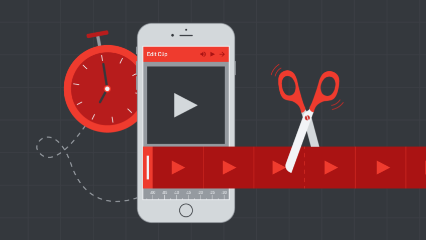
How Can You Make Your Post Copy More Accessible?
Post caption copy can be a great place to start making incremental accessibility improvements. Using plain language is valuable for folks with cognitive impairments and anyone who skims text on social media.
It’s also important to consider how a screen reader might interpret punctuation, acronyms, emojis, and hashtags. Each of these elements will be read out loud or interpreted into Braille, and not all punctuation will be conveyed fully—so a caption like, “Do you have your tickets yet? ?#almostsoldout” might sound something like, “do you have your tickets yet eyes emoji numberalmostsoldout.”
What We Do
- Write in Plain Language – We were pleased to find that many recommendations for writing in plain language included practices we already use to make our post copy shine. These include:
- Choosing common, easy-to-understand words.
- Avoiding run-on sentences and long paragraphs.
- Using the active voice rather than the passive.
- Using shortlists and bullets to organize information—just like this!
- Using more headings with less text under each heading.
- Avoiding acronyms or spelling them out when they’re first introduced.
- Ensuring that CTAs describe what the reader will get if they click—check out our CTA Generator 1.0 and 2.0 tools for inspiration!
- Identify External Links – Indicate in the copy if a hyperlink leads to an [AUDIO], [PIC], or [VIDEO] file so that users can know what kind of content they’re being redirected to—which, frankly, helps everyone who’s considering a click, whether they’re using assistive technology or not. Here’s an example of what this looks like:
- Help Screen Readers Out with Links – Keep your hyperlinks short using a tool like bit.ly! Screen readers will read the full text of the hyperlink aloud.
- Make Your Hashtags Parsable – Capitalize the first letter of each word in a hashtag so the screen reader can recognize them as distinct words, rather than interpreting the hashtag as one long word.
- Think About Structure – Place hashtags, emojis, and mentions at the end of your post, so that screen reader users can skip past them without missing any crucial content.
How Can You Design for Accessibility?
For users who take in information visually, it’s important to ensure your creative is easy to view and understand. At CI, we tend to create social media content rich with text, illustrations, and data visualizations rather than using much photographic imagery, so learning how to optimize our design for accessibility was crucial.
What We Do
Don’t use color as the only visual means of conveying information. People who have color blindness or other vision impairments may not be able to distinguish one color from another, so use color to complement what is already visible through other means, like text labels, patterns, or icons. This is especially important for our team to consider when designing infographics.
Ensure there is sufficient contrast between text and its background. The contrast ratio should be at least 4.5 to 1. Use high-contrast color combinations; avoid green on red or blue on yellow since they are difficult to read.
Use a large font size so that text is legible. Especially in images or other areas of the web where text size isn’t adaptable.
When, Where, and How Should You Include Image Descriptions and Alt Text?
This is a biggie—most of our research time was spent getting to the bottom of this complex, imperfect question.
First, it’s essential to understand the difference between alt text and image descriptions:
- Alt text is descriptive language added to images that appears in place of an image on a webpage if it fails to load correctly or while using a screen reader. Most of the time, the alt text will be invisible to the user unless they use a screen reader. Alt text should be descriptive but concise—aim for about 125 characters.
- Image descriptions are usually included in the caption or a subsequent comment in a social post and provide more details than alt text. While alt text should provide the user with the most critical information, image descriptions can give more detail.
- We love this example from Veronica with Four Eyes:
- “Alt text tells someone that there’s a puddle on the floor, and image description tells someone that the puddle on the floor is in the middle of the floor and it’s orange juice.”
Experimenting with screen readers was never more crucial than in this moment! We wanted to understand the order in which a screen reader would process each component of a social media post and how each component contributed to a holistic understanding of the content in the absence of visual inputs.
Since so much of our social content includes text and design elements rather than photography, the practices we landed on in this area are likely different from what will work best for most arts organizations. As with all of the learnings in this blog post, we hope these will serve as inspiration for you to determine your organization’s own best practices.
What We Do
- For static images on Facebook, Instagram, LinkedIn, and Twitter, we include concise alt text and no image description. The bulk of the information we convey with static visuals is text-based, and we couldn’t readily identify what additional benefit image descriptions would provide when it’s already encapsulated in the alt text. We also found that alt text was easier to access than image descriptions in captions or comments when using screen readers.
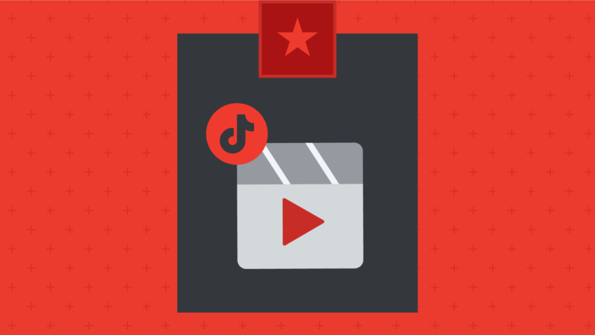
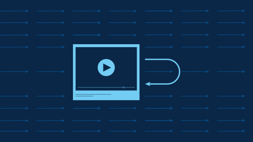
- Videos, unfortunately, don’t support alt text on most platforms, so in addition to including captions to convey all of the auditory information visually, we use video descriptions in the style of image descriptions in the caption to describe crucial visual information.
- Here’s an example of our video description for a recent Instagram Reel:
Note: Just before publication, we discovered that Instagram appears to have added alt text to videos, but only when posting on desktop. We’re still exploring what this means and how this functionality works when browsing Instagram with a screen reader.
What Challenges Do Platforms Pose to Your Accessibility Goals?
One of the biggest hurdles for devising our accessibility practices was understanding the limitations of each social platform. As people who don’t rely on assistive technology for web browsing, we began our accessibility journey with a naive optimism that in 2022, these platforms had to have optimized their user experience for access needs. We realized that, unfortunately, that’s not the case.
Here are three of the most restrictive challenges we encountered:
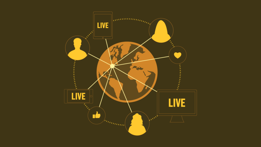
- Instagram Stories
Screen readers cannot interpret any visual information from Instagram Stories. As of yet, there isn’t a workaround to make Stories more accessible to folks who can’t take them in visually. We still share Stories content, but we also make sure our important messaging also has a place in the grid. - Facebook Creative Hub
We love to use Creative Hub to build ad content and organic posts because it allows you to see how a given piece of content will appear across all placements. The challenge? Unlike images posted natively on your page, there is no option to include alt text in images uploaded through Creative Hub. For our organic Facebook content, we’ve adapted our content, so we post natively every time, foregoing our beloved Carousel format for the native collage format. - Facebook Ads Manager
As of now, Meta does not permit alt text to be included in paid ads unless you are promoting a post that was already shared natively to your organic feed. This means if you have dark posts (posts that don’t appear on your organic feed), you won’t be able to add alt text. You also can’t add it to Meta’s variety of paid placements.
We’ve reached out to Meta customer service, CI’s Meta rep, and the accessibility-specific customer service team at Facebook and haven’t received any additional information. We’ll keep you updated in this post as we learn more.
How Do You Rethink Your Content with Accessibility in Mind?
Throughout our process, we identified ways that we could improve our content with accessibility goals in mind. Rather than just relying on alt text and image descriptions to make existing content more accessible, we started to consider how we could factor more user perspectives in from the first brainstorming meeting.
What We Do
- Make sure video and audio components convey the same, complete message. – Translating auditory information into video captions is something we’ve worked on for some time. Now, we’re also thinking about the other way around, ensuring visual information is also expressed audibly. Sometimes, the solution is simple: for Q&A-style videos, we make sure they are voiced over instead of just displaying the questions on screen. However, it can be more challenging when we’re ideating more elaborate video narratives, and this is one of our biggest areas for continued growth.
- Choose accessibility-friendly formats.
As mentioned above, platform limitations make some content formats more widely accessible than others. Instead of creating organic Facebook carousels in Creative Hub, we now opt for the native collage format, which allows us to add alt text. When information is crucial for our followers, we share it on our Instagram grid instead of only in Stories, which aren’t screen-reader friendly.
It’s given us a fresh perspective to think about accessibility from the beginning of the process.
These learnings are not comprehensive, and our work to improve our accessibility across social media and beyond is ongoing. If you have feedback or additional suggestions, we welcome your comments below!
For now, we’ll leave you with these final tips:
- Consider how you can keep this work moving forward, even when your team is busy. For example, we meet once a week for 15 minutes to work through any accessibility challenges we’re facing with that week’s content and have a more extended quarterly meeting to revisit these best practices and explore ways to improve further.
- Compile your best practices in a concise, easily accessible shared document. This way, everyone on your team can reference them while working on new content.
- Just get going! You can always keep iterating, so don’t let perfectionism hold you back from taking the first step.
- Stay nimble, open-minded, and curious! There is no one perfect solution that will work for every platform or every content strategy. Discover what works best for your content, and continue to iterate.
Want more accessibility resources? Check out this reading list:
Federal Social Media Accessibility Toolkit Hackpad
Social Media Accessibility Best Practices from DBS Interactive