Is Your Website Truly Optimized to Sell Tickets?
As the analytics lead at Capacity Interactive, my job revolves around on-site behavioral data – collecting it, analyzing it, making informed decisions and strategic recommendations based on it. Data can be analyzed in many ways, and I don’t believe in a cookie-cutter approach. Every client is unique – in who they are, what their objectives are, what kind of content they have, how their website looks, what tech platforms they use, etc.
However, even though I’m not a fan of generalizations, there is a trend across almost every single client and can be represented by the following charts:
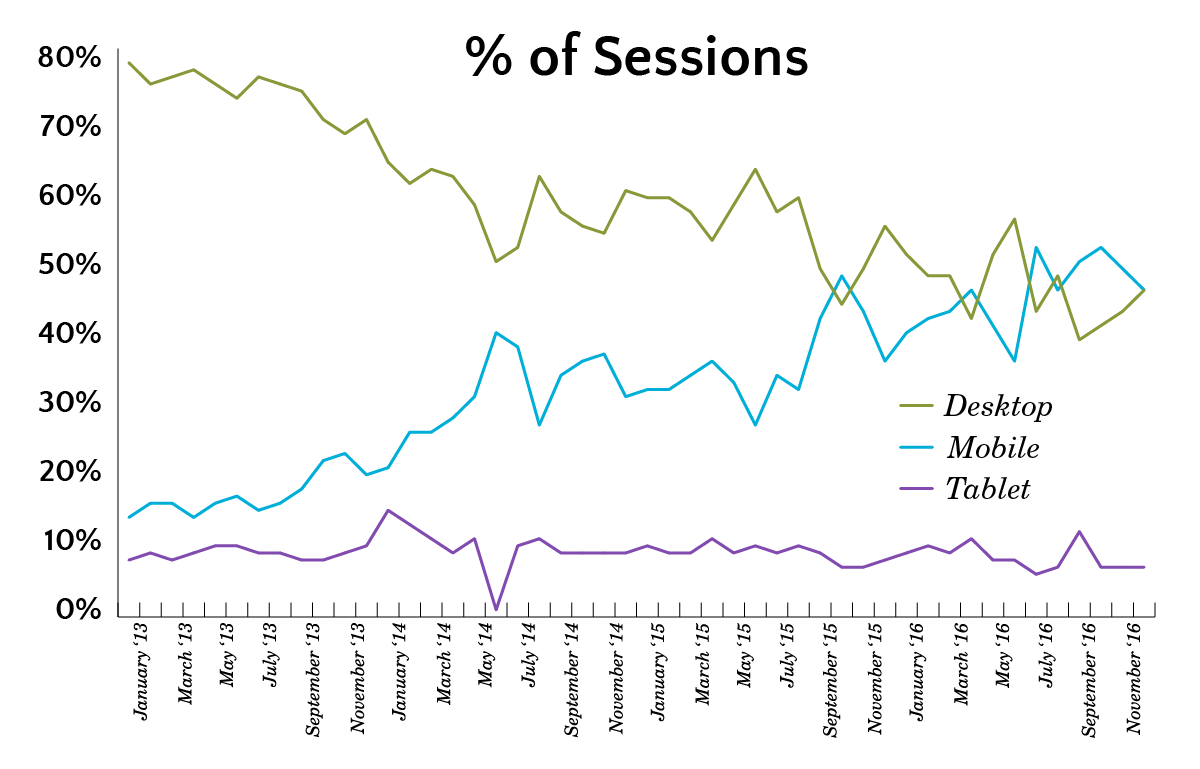
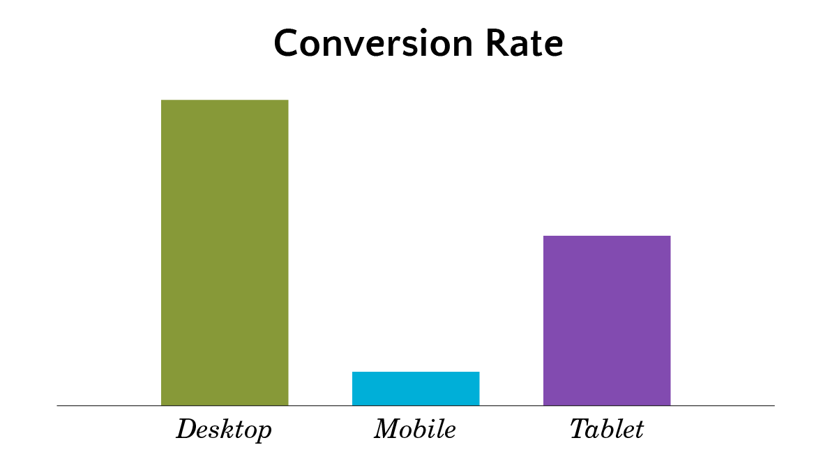 Your mobile users convert at a fraction of what your desktop users do – and this is a challenge that keeps growing in importance.
Pro Tip: You can easily create these charts by going to the Mobile Overview report in Google Analytics – it’s located in the Audience tab. For many organizations, these types of charts will help you make the case for having a mobile-optimized solution.
While having a user experience designed specifically for mobile users is a must-have, it’s crucial that we don’t think of it as the final step with mobile.
The crazy truth is that no one has really figured out mobile yet. Some organizations are better than others, but our industry is screaming for a better solution. I can’t pretend to have the answers on what that solution looks like, and I wouldn’t imagine that there is a cookie-cutter approach for what that solution looks like.
There are, however, some areas that I think are critical to explore and consider for our mobile sites.
Design great mobile landing pages
We lose so many mobile users right away with landing pages that aren’t designed for them. Look at your Google Analytics data to determine your top entry pages for mobile users and measure their bounce rate to identify where to prioritize your efforts. Keep in mind the context of the session – a great landing page isn’t solely about the design of the page on its own, but about how the content and design aligns with the messaging of the source for the session. For example, most people are seeing your Facebook campaigns on their mobile devices so make sure that you drive them to a mobile-friendly landing page where the messaging between the campaign and landing page is consistent.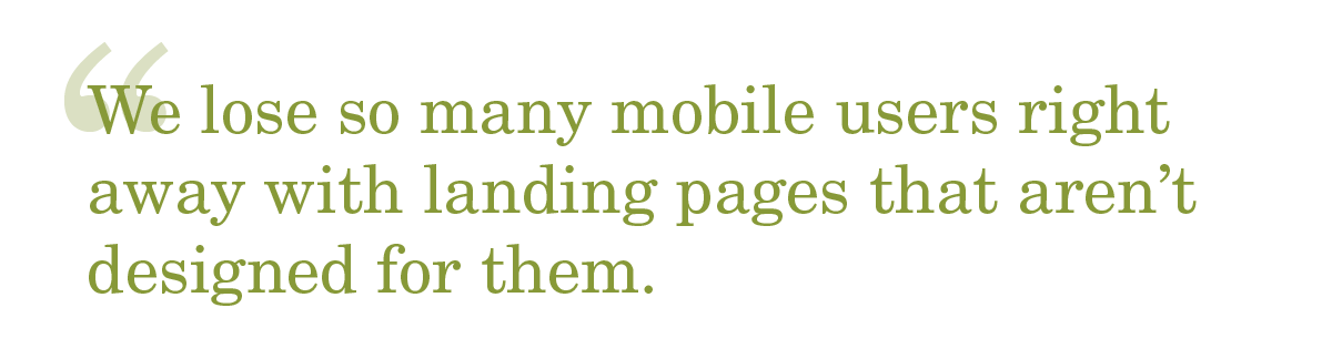
Create and test a “Call to Purchase” user option
Ideally, we’d like to have mobile users buy on mobile-optimized purchase paths. Some users, however, might find it easier to call the box office to purchase and they already have their phone in their hands. We can leverage the phone’s functionality to make a phone call and sell tickets via the box office.
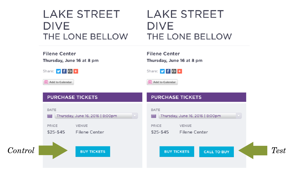
We recently tested this idea for Wolf Trap Center for the Performing Arts. We ran an A/B test on mobile performance detail pages with a random sample of traffic going to control and a random sample going to the test version we created, which had two purchasing options: purchase online or call to buy. Our test version had a lift of 19% in sales!
Utilize cross-device remarketing
Google and Facebook let you remarket to users across devices. You can set up remarketing campaigns specific for mobile users that don’t convert so that you can target them when they’re on a desktop and can access the version of your site that converts better.
Conduct a user-centric analysis on your mobile site
We often are guilty of becoming accustomed to how our sites and purchase paths work, but we must have a user-centric approach to our design at all times. By conducting a user-centric analysis, ideally using your Google Analytics data and pairing it with some usability testing, you can identify the areas that have the biggest challenges and use those findings to prioritize your initiatives.
Pro Tip: One particularly powerful report to utilize in Google Analytics is the Funnel Visualization. If you set this up in your account, you can see the progression rate for each step in your purchase path and use this data to identify where in the process users are dropping off.
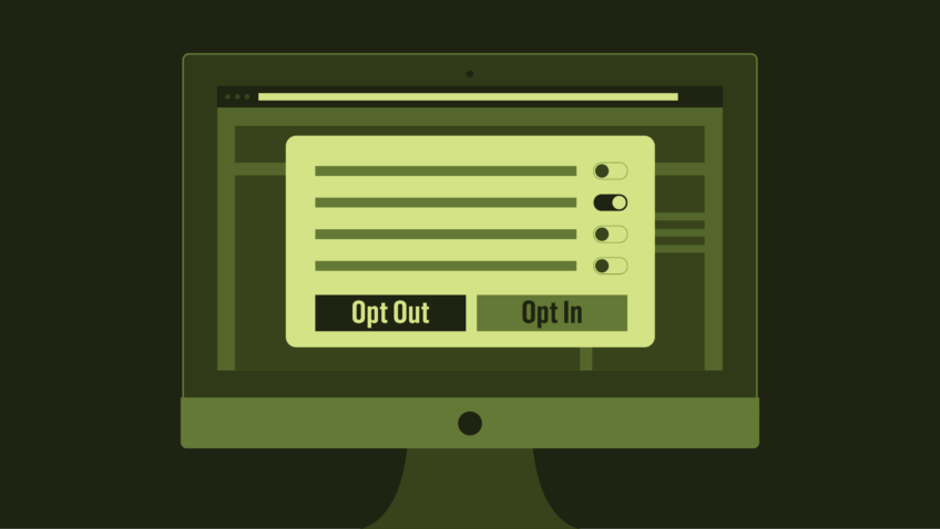
SYOS or Best Available Seating?
Most arts organizations offer SYOS (select your own seat) functionality as the default seat selection method. We want to give users the choice of picking their own seats. On a desktop device, I believe this makes perfect sense, but I personally am not entirely convinced this is necessarily the case for mobile.
 SYOS is complicated, it takes many steps, and it generally will require the user to pinch to zoom in/out a few times or rotate the screen to landscape orientation. Data can back this up, too. In most cases, the drop-off rate between SYOS and the Shopping Cart page is significantly higher on mobile.
Maybe mobile should default to Best Available Seating? Is this heresy for me to suggest? I don’t have the answer to this question and I am going out on a limb a bit by suggesting this idea, but I would be fascinated to see someone test this out (ideally in an A/B test).
Simplify the experience
Your mobile-optimized site should focus on your primary objective – in all likelihood, selling tickets. We should look to get rid of unnecessary steps as much as possible. This is a general ethos for all design, but is particularly critical for mobile experiences where we have less real estate to work with and the Internet connection is usually slower than plugged in devices.
 How can you improve and simplify the experience? Make the steps in the purchase path have a default state that is based on user behavior (e.g. auto-select print tickets at home as the default setting if that’s your most common user option). Remove fields in forms that aren’t absolutely necessary (e.g. do you really need the user’s prefix and middle name). We can often add by subtraction in website optimization by getting rid of non-critical steps.
Controversy warning – Removing add-on donations in the mobile purchase path
Before you get out the pitchforks, hear me out. The reality is that most users don’t attach a donation to their order. You can see this in your data – run a report showing how many of your ticket orders have a donation in the order. You’ll likely see this is a much smaller percentage than you’d expect. You can repeat this analysis and only include mobile purchases – the percentage will only decrease (my guess would be that less than 1% of mobile orders have a donation).
Every additional step in the purchase path is potential additional noise and confusion for the user, and an additional opportunity for the user to drop-off. Now, by no means should you stop asking for donations. But maybe you can do so as part of a follow up email instead of in the purchase path? (I’d test sending the email after the performance date when the user had the in-person experience and has an emotional attachment to your organization). You’ll likely increase both your mobile conversion rate AND your donations by separating the tasks.
Push your tech platforms
In many ways, your digital success is connected to your tech platform’s functionality. As arts marketers, we should look to our technology partners for technological innovation.
We should also continue to communicate our challenges and priorities so they incorporate our needs into their product roadmap. Just like we look to our user data to inform our decision making process, we should provide them with the data (in the format of feedback) to inform their process.
Optimizing mobile experiences is difficult, and by no means do we have all the answers. The items above aren’t meant to be a comprehensive list. We must, however, keep pushing to make mobile experiences optimized for selling tickets. Having a “mobile optimized” site should not be limited to a one-time activity that is part of a redesign, but needs to be continually iterated upon and improved, with users being your primary stakeholders, data being your users’ voice, and testing being the process for experimentation and improvement. As we keep seeing a greater share of our digital traffic take place on mobile devices, we risk losing sales and having empty seats if we fail to improve our ability to sell tickets on mobile devices.
Want to learn more about optimizing your landing pages? Sign up for a 30-minute call to discuss web analytics and A/B testing.
{{cta(‘2f595722-8ba4-43fc-9380-070d4771459d’)}}